 |
| Android and iOS new design |
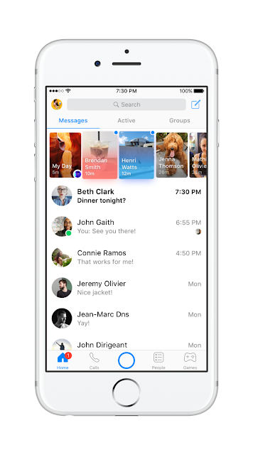
Messenger new design will come with new tabs at the top of the screen which will help users move between Contacts, Active Chats, Groups, etc and in addition to that, the new design will now push you to other areas of the app where there is any activity with the help of a red dot.
Facebook explained that this new design will help in the way many users connect with their friends and loved once beyond using text messaging.
 |
| iOS old look |
On this new design you will find several tabs at the top of the screen, switching to Active chats will show you all of your friends who are active(indicated with a green dot) and those who are not active but are on Messenger (indicated with a blue dot).
Facebook has also decreased the size of the camera icon at the bottom of the screen which before now is bigger than other buttons at the bottom as well. This will solve the problem of users clicking the camera button at the bottom mistakenly. The new design at the bottom now has Home, Calls, Camera Button, People and Games. On iOS, there are labeled, too, where before they were just the icons. (On Android, the app is sticking with only the icons.)
 |
| iOS new design |
Another new design Facebook added is the red dot which indicate any unseen activity on the Messenger application. Though this might look good to some, again to others, especially those who don't like seeing those dots, those who perceived it to be annoying, be ready to be clicking everywhere you see red dots.
The new Facebook Messenger design will be rolling out to users (both Androis and iOS devices) starting from this week.


![Here Is A List Of Android Phones With IR Blaster [Used As Remote]](https://blogger.googleusercontent.com/img/b/R29vZ2xl/AVvXsEjAi_1D-da_zZG9DpAh5YI-t2JxkECnycWsY5IarlmTsXxm4Dr9aqbzv5ugrOKn9rXSv6jmFHoexZVNGa2WCu7Byfpb5lUlnWxm38UoRyeSKISdEYi1JwFu_AdQhZ_tv5GQx5V-FDrSQpNk/s1600/IMG_20170207_215140_414.JPG)


No comments:
Post a Comment